We live in a world where consumers browse websites via multiple mediums other than desktops, such as smartphones, tablets, etc. Users find mobile devices rather convenient as they can access information remotely anytime they want. It is the sole reason why brands, especially consumer brands, must ensure that their websites are mobile-friendly and easily accessible to the ever-growing audience.
Did you know?
70% of mobile searches trigger an action within an hour?
Optimizing websites to be compatible with mobile devices, therefore, becomes crucial, although it takes a multi-step approach. Besides development, brands also need to ensure that their content, designs, loading speeds, etc., are catered specifically for mobile usage. Let’s look into multiple best practices for mobile marketing that brands need to adhere to.
Page Contents
10 Best Practices For Mobile Marketing
Mobile marketing can be a powerful tool for reaching and engaging with customers, but it’s important to approach it in the right way. Here are some best practices to keep in mind:
1. Keep The Site-loading Speed in Check

“Consumers today are more demanding than ever. They will move on to someone who delivers faster, and it can potentially cost you sales”
Google offers a free tool to test the site-loading speed of your websites for multiple devices. It also gives viable feedback on what you can do to improve the loading speed for mobile devices. The Google algorithm also considers the site-loading time for page rankings. So, if your sites are lagging, it can negatively affect your website’s page rankings.
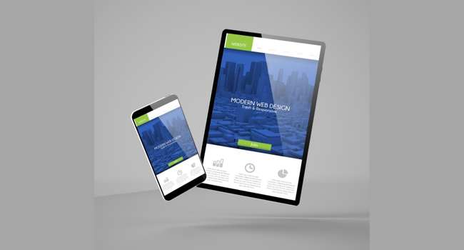
2. Use Mobile-Friendly And Responsive Designs
Designs are the first thing that users interact with. Therefore, it is crucial to ensure that your website designs are optimized for mobile devices. A responsive design ensures that the layout of the website automatically adjusts to fit the screen size of the device it is being viewed on.
It is important because it ensures that the website is easy to use and navigate on a variety of devices. It contributes to serving a better user experience and makes it easier for customers to interact with your offerings.
3. Use A Mobile-Friendly Layout

The layout of the website should be designed specifically for mobile devices. Keep these pointers in mind:
- Use larger buttons and links that are easy to tap with a finger.
- Avoid using small fonts that are difficult to read on a small screen.
4. Create Mobile-Friendly Content
If a website or content is not optimized for mobile devices, it can be difficult for users to read and navigate, leading to a poor user experience. It can result in a higher bounce rate, lower conversion rates, and lower website traffic. It can also lead to lower rankings in search results.
Keep in mind that mobile devices display content on a small screen, and users want exactly what they’re looking for with fewer clicks. Here are a few things you can do to make your content mobile-friendly.
- Ensure you add short and crisp headlines.
- Optimize content for search engines.
- Use the specific keywords that users are familiar with.
5. Use Google My Business
Location-based marketing is another important tool in the marketeer’s arsenal and a best practice for mobile marketing that they should pay attention to. With location-based marketing, you can target customers based on their location. For example, you can send a special offer to customers near your store or restaurant.
You can get eyeballs turning to your websites through the local audience. Often, mobile users look for local information, and getting your business on the local map will ensure that customers discover you. Once you get your business listed on Google My Business, you’ll notice improvements in overall search engine traffic.
6. Use A Mobile-Friendly Content Management Systems

A content management system (CMS) like WordPress or Joomla can make it easier to create and manage a mobile-friendly website. These CMSs often have built-in responsive design features and mobile-specific themes that can help ensure that the website is optimized for mobile devices.
7. Use SMS Marketing

Smartphone users check their phones quite often. They are always ready to use them to find information. So, you need to get into their inboxes. SMS marketing can be an effective way to reach customers, especially if you offer special deals or promotions.
Many brands frown upon SMS marketing because they believe the notion that no one pays attention to text messages. But that’s not true. 41% of users use their mobile devices for text messaging than talking. Let’s look at some benefits of SMS marketing:
- You can easily track your SMS campaigns to find out who opened your message and what links did they click.
- It enables immediate delivery of your offerings. All you need to do is set up a campaign and get thousands of impressions within minutes.
- You can personalize the text easily, and take a more informal approach.
Pro Tip: You can use SMS marketing for your loyalty programs. You can incentivize your loyal customers to take action by sending them an SMS about seasonal offers, discounts, and coupons.
8. Make Your Websites Navigable

Navigation is another best practice that marketers should pay attention to. Poor navigation can negatively affect your conversion rates. Ensure your sites have responsive navigation with the menu, sub-menu, footer, header, etc., in place. Ensure that you make your CTAs compatible with the mobile interface.
9. Use Mobile-Specific Landing Pages
When running mobile marketing campaigns, it’s crucial to use mobile-specific landing pages. These pages should be optimized for mobile devices and should clearly convey the value of your product or service.
10. Create QR Codes

Creating QR codes for enabling quick access will take you to the next level of mobile marketing. QR itself stands for “quick response.” The code stores all the data that can be transmitted digitally through a single scan. So, if your business requires a lot of data to transmit through a mobile browser, QR codes are a winner. It helps you speed up your website and make it more easily accessible for mobile users.
Final Thoughts
In conclusion, making a website mobile-friendly is essential in today’s digital landscape, as more and more users access the internet on their smartphones and other mobile devices. By using a responsive design, a mobile-friendly layout, optimizing images, avoiding pop-ups, and using a mobile-friendly CMS, you can ensure that your website is easy to use and navigate on multiple devices. It will provide a better user experience for your mobile visitors and can help improve the overall success of your website.